The Dream Bathroom Reveal
July 5, 2021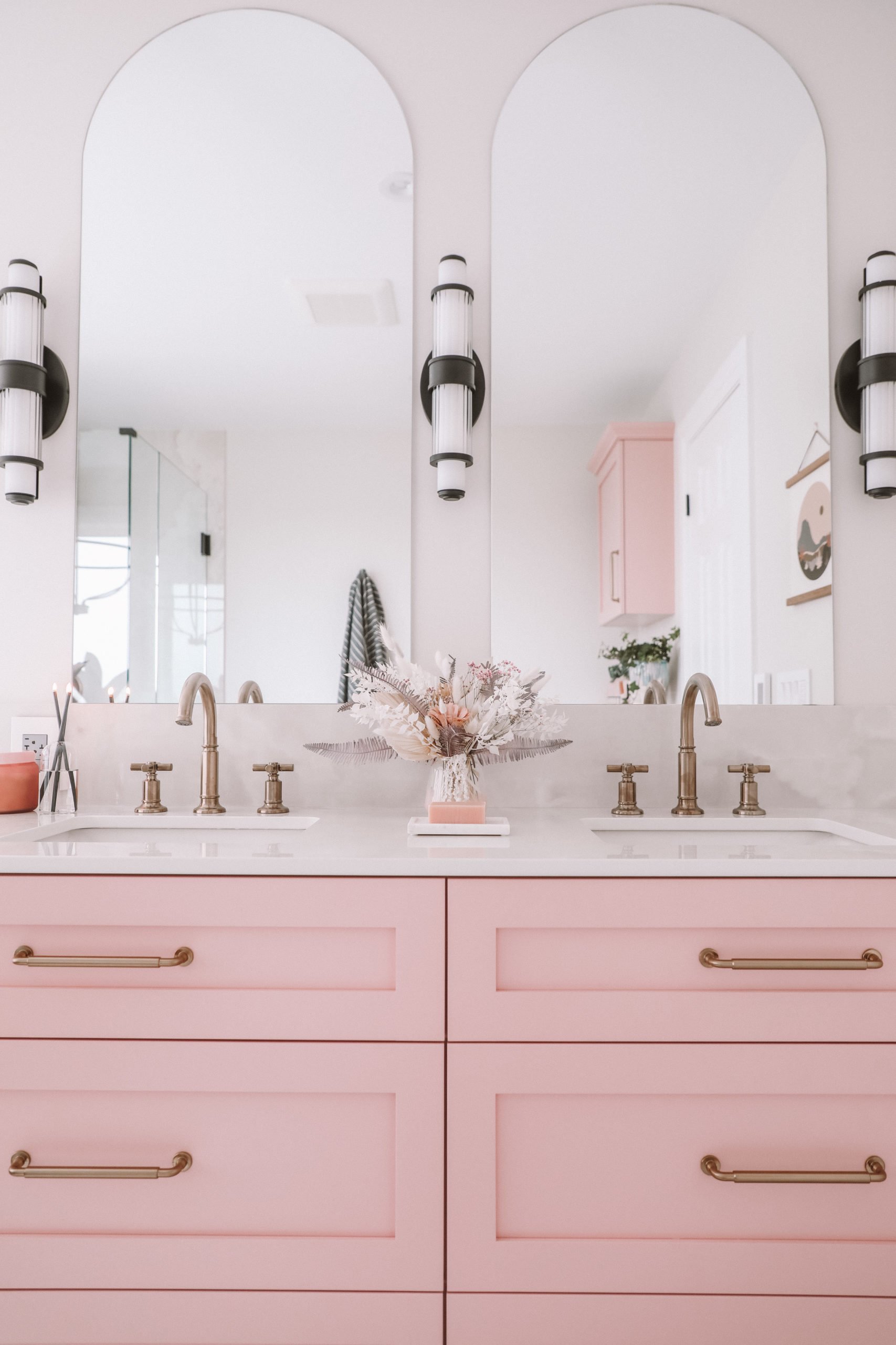
After a long, held breath, I’m ready to reveal our bathroom.
To give you a bit of backstory, when we bought this house we knew it needed updating. We decided to pick one piece of it a year and do something. The 2020 project was supposed to be a fence, butttt…. to my own luck, lumber was on shortage and it had to be postponed until this year. So my bathroom skipped the line. Wee!
I’m going to go ahead and say that I’ve never been a part of a renovation before. This was all entirely new to me, and all entirely intimidating.
It all started with a DM.
As most things do in my life.
I had seen Delve Interiors post a bathroom on her IG and was immediately just ready to go for it, find out what we could do, what it could look like, and if it was possible.
So let’s start with the before.
And y’all, I did not clean up for these pics because I did not expect to be posting them EVER. So this is the real real.
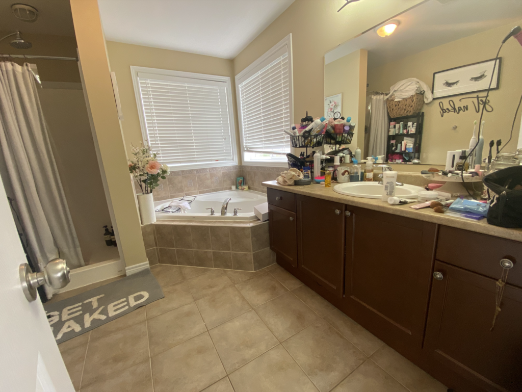
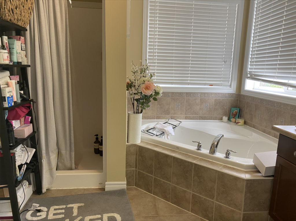
So let’s start with the problem areas.
The shower: A standing coffin.
The storage: two drawers only…and plumbing through the middle…so basically, nada.
The design: it was outdated and not us.
I had a bit of a clear vision for the design I wanted without any idea on execution or how it would work. Thankfully Rachael at Delve, did. After we browsed all the options, she sent me a bit of a design board.
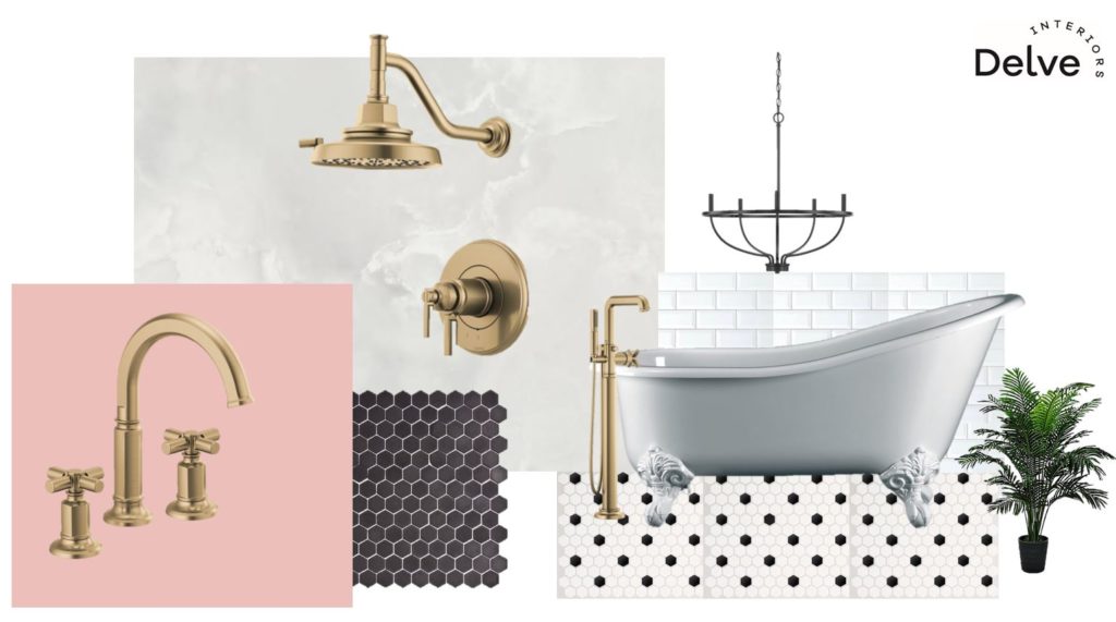
I was deeply inspired in the colours and design by one of my favourite blogs, A Beautiful Mess and Elsie’s Guest Bathroom.
Now, for the big question I get a LOT…
HOW DID I GET MY HUSBAND TO LET ME DO A PINK CENTRIC BATHROOM?
Sharing a home and having clashing design visions can be hard. Pink, a classically feminine colour, is often looked down upon by men and therefore brings this question up, a lot.
Year ago we had conversations about the home and it’s design. Shane cared about the outdoors, and the loft. He didn’t really have an opinion about a bathroom design, so why stop me and all of mine? So he didn’t “let” me, he just has opinions in different places. Like his loft. To which, I “let” him do whatever he wants…which apparently is a pinball machine collection.
Back to the bathroom, because y’all are probably just scrolling to the photos and details anyways.
Once we had a design vision in place, it was time to book a contractor, which we had to wait a bit for availability and he was SO worth the wait. Ben with LPC Construction became a fixture in our home for months. Given the pandemic, he was one of the only people we even saw for days at a time. So much so, the dog would cry for an hour after he left. We actually miss him walking in the door everyday! He managed the entire crew (all delightful) and the project rather seamlessly, we just had to sit back and enjoy the process of witnessing the transformation.
Also, our house was never cleaner. Yes, during a renovation. Because they cleaned up all the way from the front door to the bathroom incase any dust was left. So basically, they swept and vacuumed daily. Cleanest it ever was.
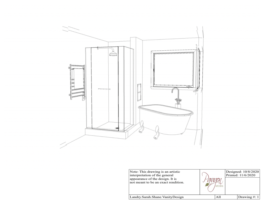
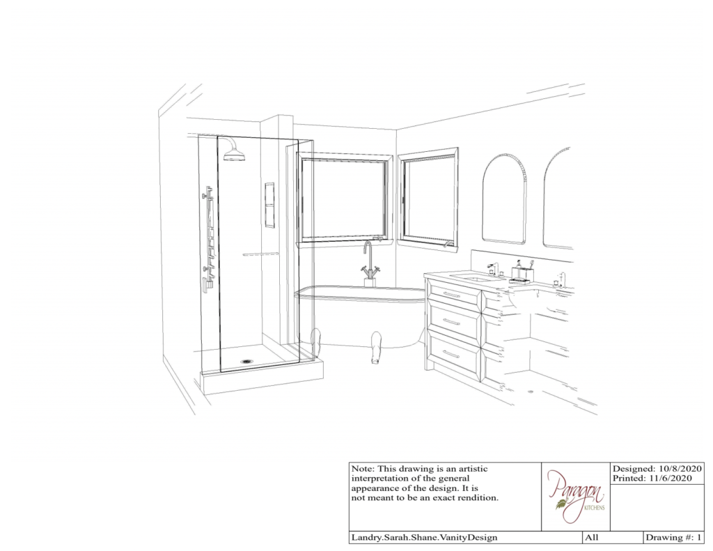
Next we sat down with Paragon Kitchens. They had photos and measurements of our bathroom, and created 3 differnent visions. Our goal was to do the least amount of moving of plumbing, and optimize on space. This was what the design looked like that we chose. What’s amazing, is this felt like the first time it had real vision, and how accurate these images are to the final results. We’ll get there, I promise.
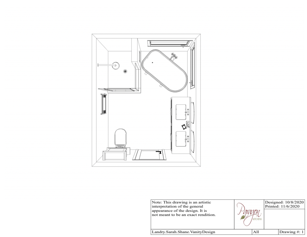
With a plan in place, and the perfect pink selected, Paragon Kitchens went to work on the custom vanity (which was important because again, storage was in need, and they had to design something to work around the plumbing that was causing us to lose out on so much space). The result was unreal. Again, we’ll get there.
ARE WE READY????
WEEEE!!!
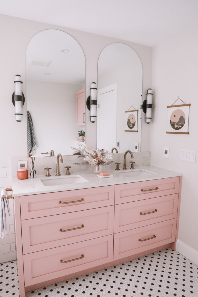
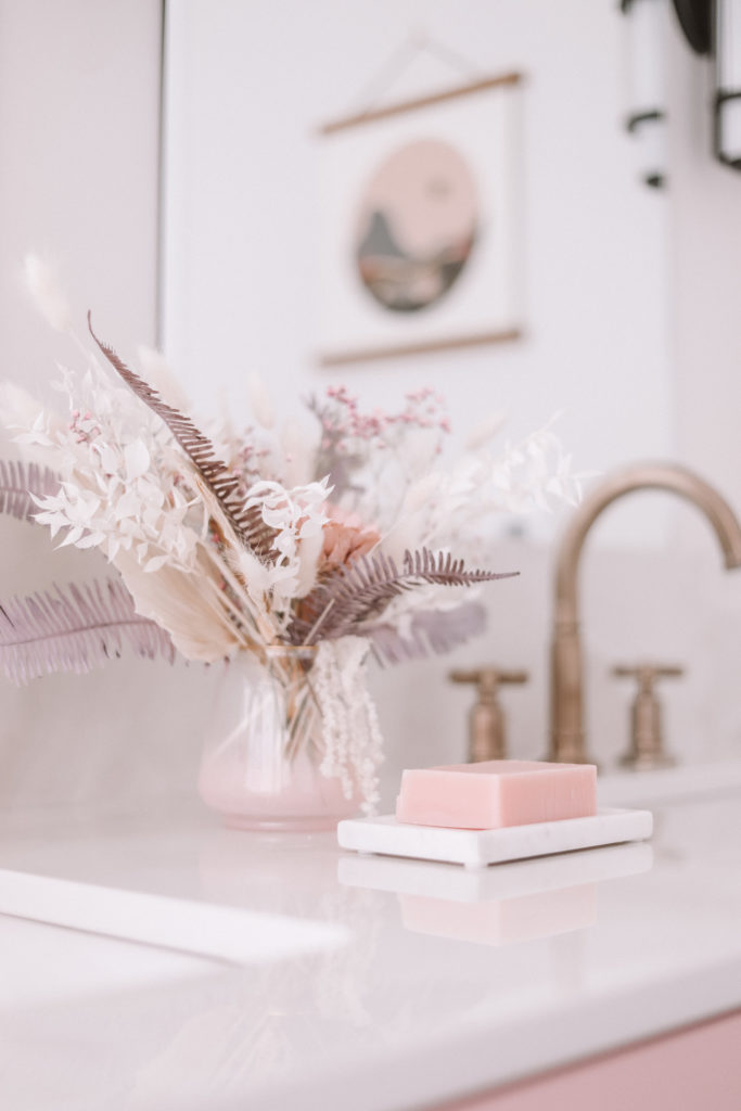
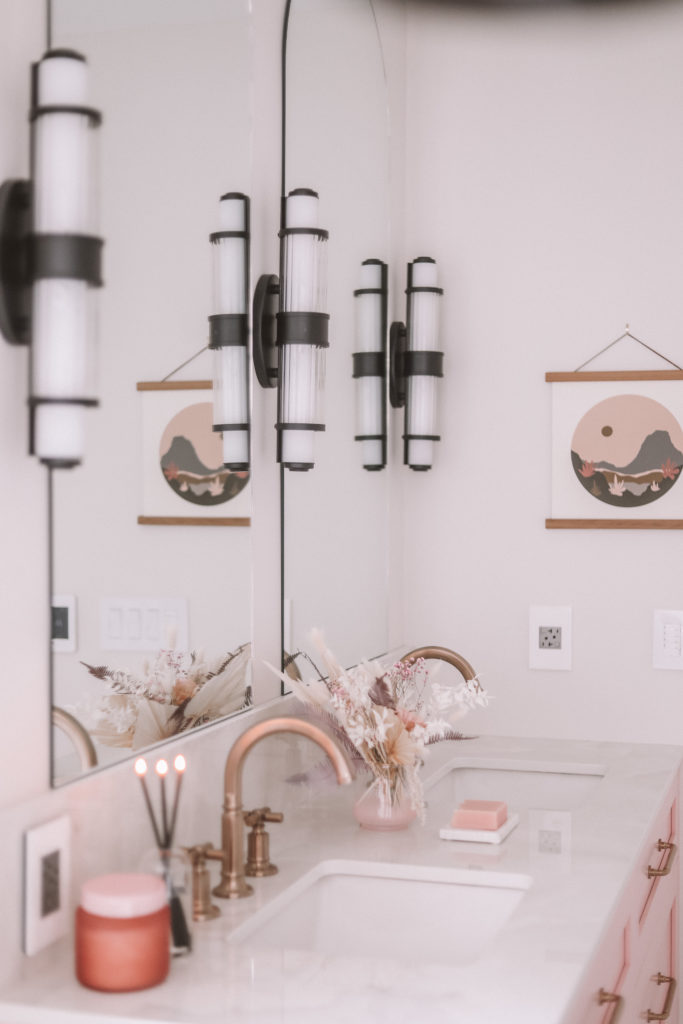
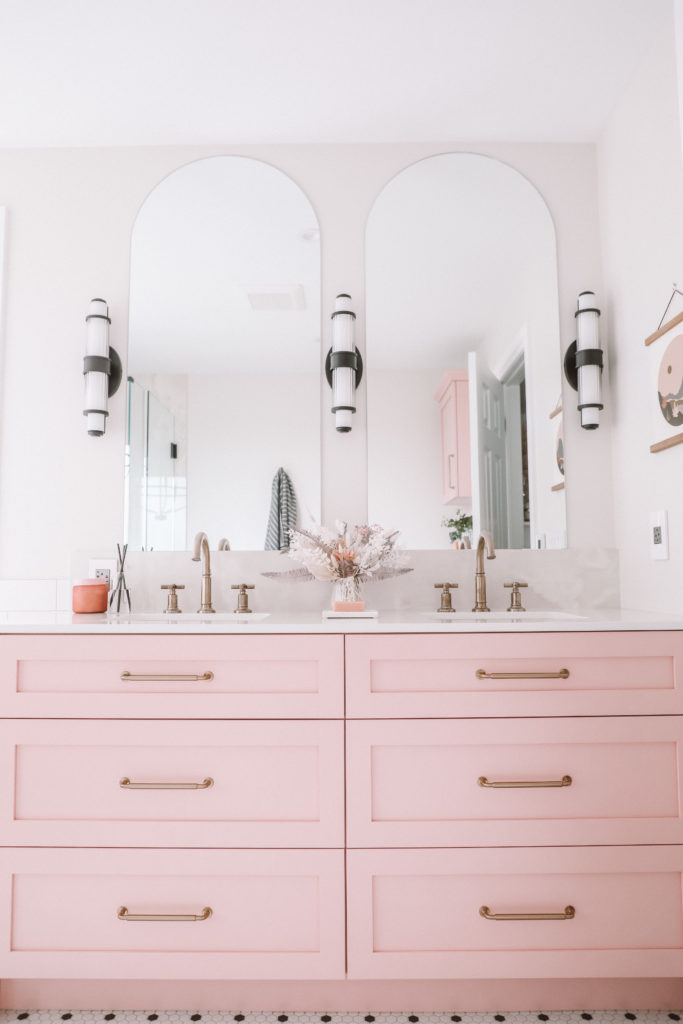
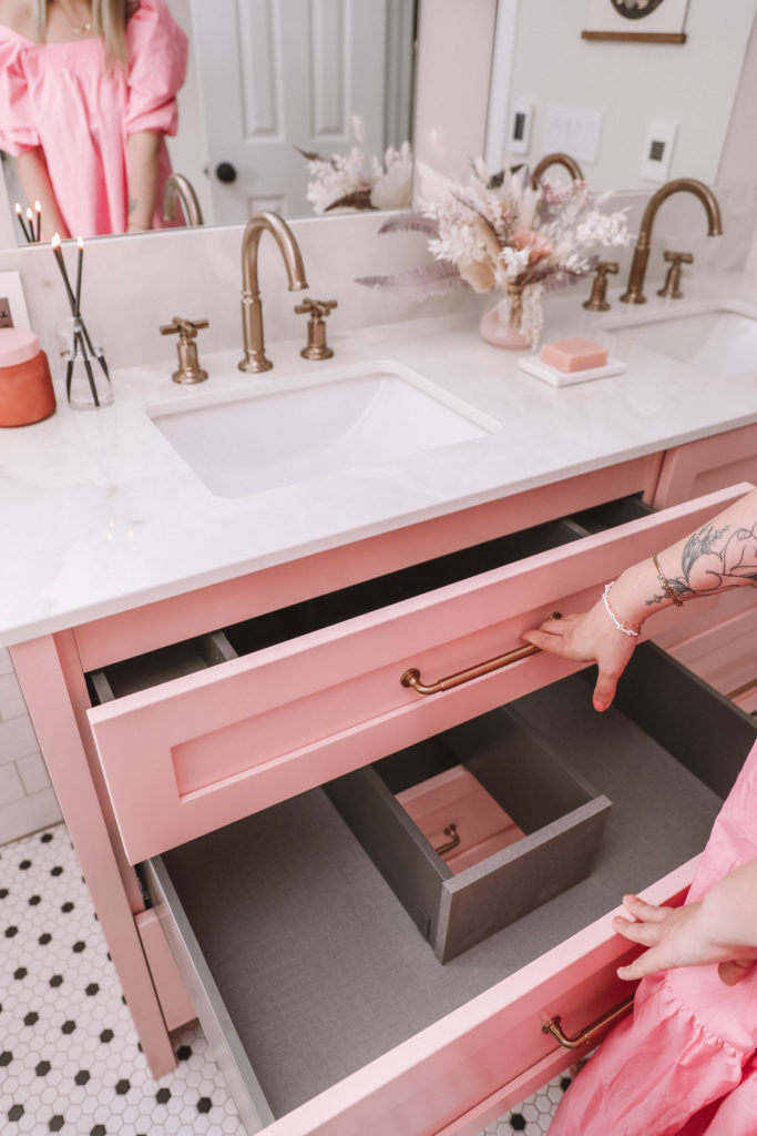
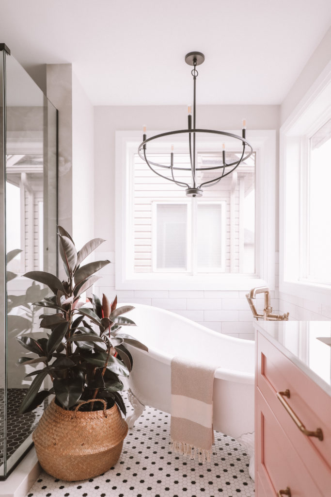
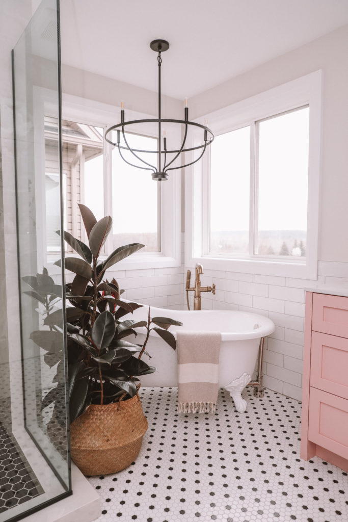
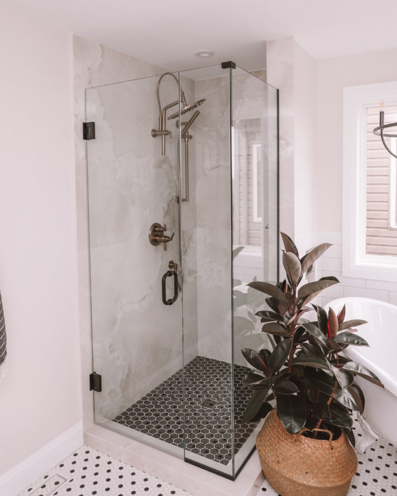
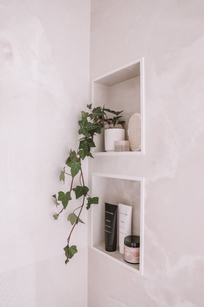
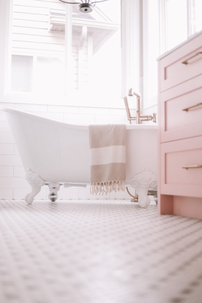
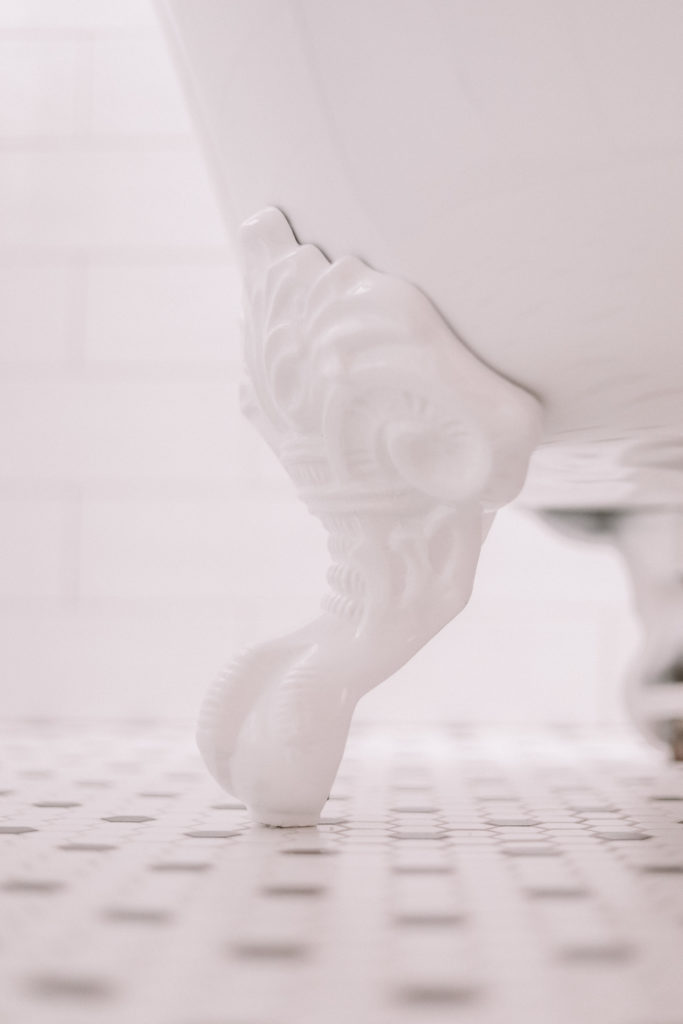
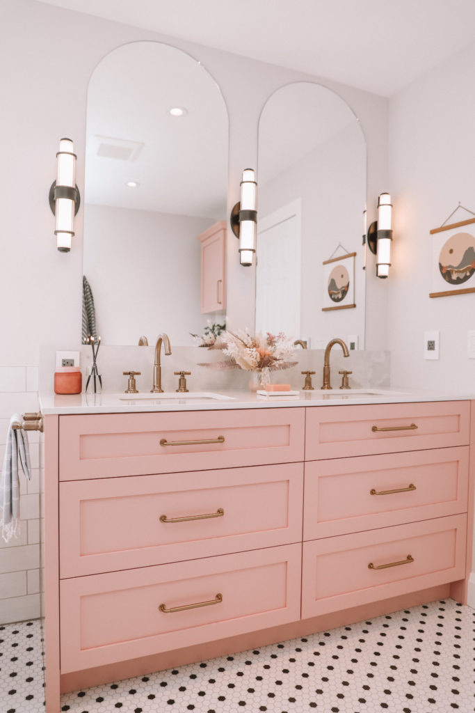
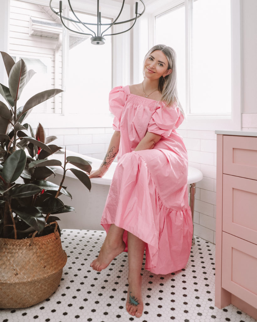
And here’s me using the bathroom, the only way I see fit: for photos. It’s too pretty to poop in. I’ll get there, eventually. For now I just love relishing in it, and owning this space.
Let’s go through the sections with details!
Vanity
As I mentioned, Paragon Kitchens was incredible at the design and installation of this truly custom piece to optimize on space and storage that worked around the plumbing.
- The paint colour is called Pink Hibiscus by Benjamin Moore
- Cabinetry design and installation by Paragon Kitchens which is a local Guelph, family business.
- The drawers feature soft close slides and hinges.
- Drawers feature a beautiful linen finish inside.
- Handles by Top Knobs!
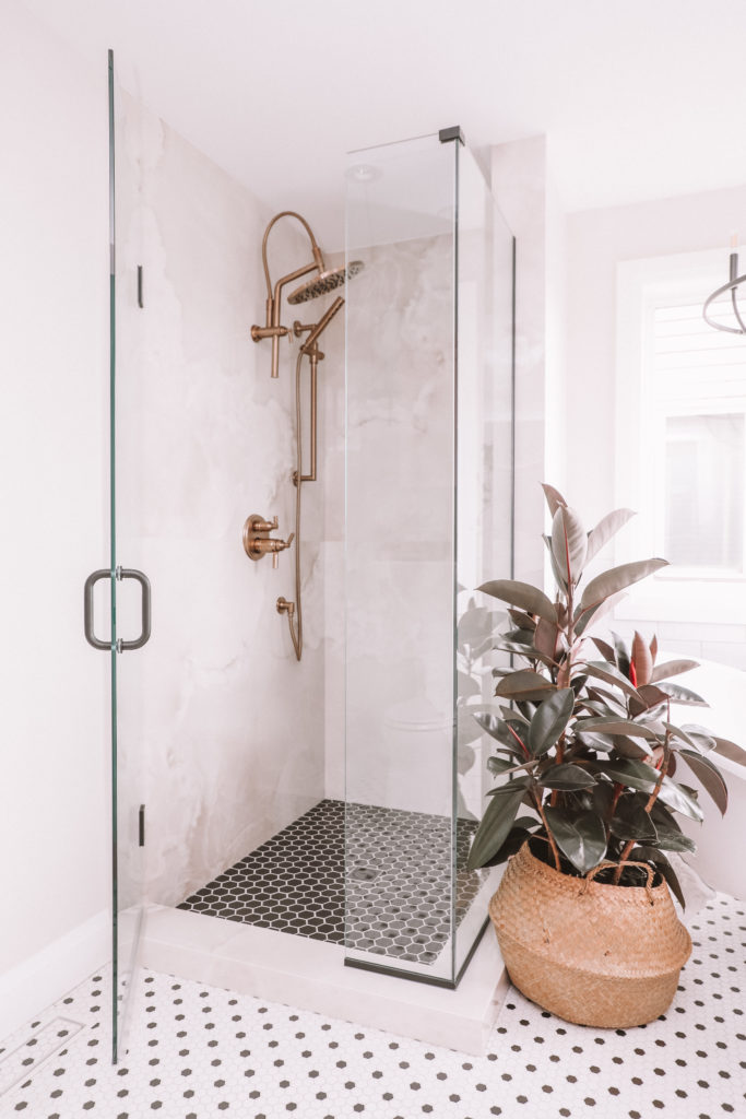
- The countertop name is “Helena” by Dekton (parent company Cosentino), it’s fabricated by Quartzco and is a sintered/ultra-compact stone surface in a high gloss finish. It’s completely graffiti-proof AND heat-proof, so putting my hair iron or other hot items on the countertop is no problem. The stone carries up onto the wall behind the sinks for a 6″ backsplash as well. This countertop is the same as the stone in the shower wall surrounds and looks like beautiful clouds.
Lighting
All lighting was sourced from Universal Lighting.
- Chandelier: Capital Lighting, 1 Greyson 5 Light Chandelier, Matte Black
- Sconces: Savoy House, 3 Delaney Sconces, Classic Brass – sprayed matte black with service universal lighting offers. Matching metals is hard, and the brass wasn’t quite right so spraying them matte black was the right choice because ultimately we loved the style of the light we just needed a different finish! They turned out incredible.
Fixtures
All the fixtures came from The Ensuite: Bath & Kitchen Showroom. Having all the fixtures come from one line and one place helped us streamline the look and feel of the bathroom in all areas. Shower, Tub, Vanity.
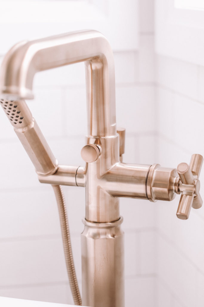
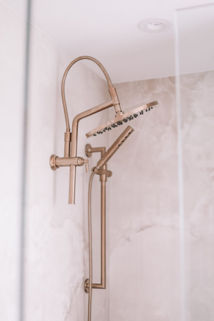
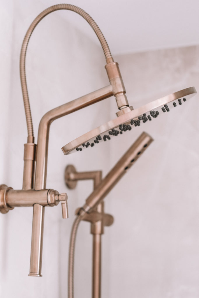
- The colour of these fixtures (tub, sink, shower faucet) is called Luxe Gold!
- The family name of the fixtures is called Invari, by Brizo.
- Our bathroom vanity double sinks feature 2x 8” wide spread faucets in luxe gold with the Arc spout and the cross handles.
- In the shower, it features a thermostatic share function shower controls. Set your temperature preferences separately from the off-on function for a perfect experience every time.
- Multi-function – slide bar
- The coolest shower arm ever – arc with adjustable heights!
- 12” rain head (TWELVE INCHESSSSS)
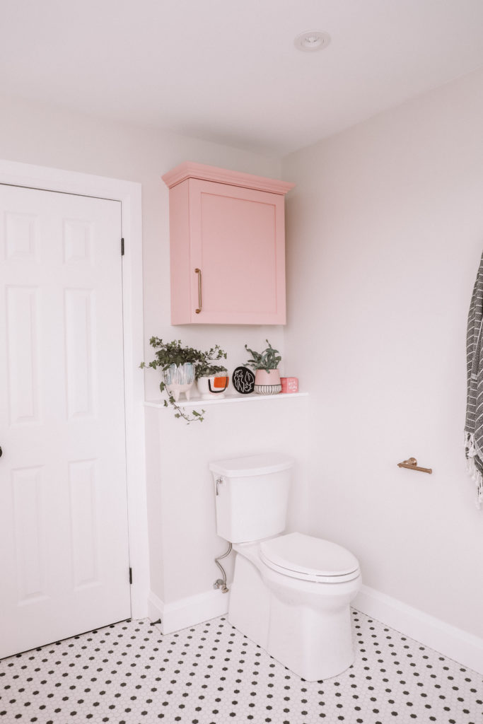
- Accessories – Tissue holder, 8” towel bar, Robe hook are all a part of this line.
- The tub features a floor mount faucet with a removable hand shower.
The Tub
Also from Ensuite, this tub was an absolute dream come true. We were shocked to find out that we could fit a claw foot tub into the corner of that bathroom, given the space we were working with. Just goes to show you that good design can go a long way in optimizing a space. If there’s a splurge piece of the bathroom, it’s the tub!
- The tub is by the UK brand Victoria and Albert, distributed by Ensuite.
- The style is a Shropshire clawfoot tub in white – with Polished Nickel feet
- This is what’s considered a slipper style tub, named for its shape of a slipper or shoe.
- Victoria and Albert tubs are uniquely made with from 100% ENGLISHCAST™, a blend of Volcanic Limestone™ and high performance resins. With this, the tub will hold the heat longer because it has the Volcanic Limestone rock in it.
Tile
It’s funny to me that the entire bathroom started off of the love for a single tile style. You know the kind, you’ve seen it, but it looks SO expensive and you probably assumed it was.
Ceramic Decor (another local Guelph business) was the provider of all the tile from the bathroom floor to the shower, and the subway tile surrounding the tub as well. It’s an absolute dream come true. Tile, as it turns out, is a great starting place and inspiration for an entire bathroom.
Here’s the details:
- Floor: Soho black & white hex 1×1
- Tub Surround/Wainscoting: Picadilly White 4×12
- Shower Floor Tile: Ontario hex black (matte) 2×2
Mirrors & Glass
Finding and shopping mirrors is so difficult for me, finding out you can have custom ones made was so new, and so exciting. Immediately after seeing the mirrors, I ordered a massive 7 foot one for my main floor, at a FRACTION of the cost of a finished in-store one.
Made & installed by the most incredible small business team, Cr8tive Glass & Showers in Elora, Ontario.
This team also installed the glass surround on the shower!
Plants, Accessories, Styling
Of course when it came to the finishing touches and styling, there was no better to go to than my friends at Blooms & Flora and Sunday General, local sister stores that feature home and plant and florals to complete the space. Don’t worry, they also ship online many of their items. With little gifted bath accessories as well, it really just brought a finished feeling and a warmth to the entire space. Oh, and the owner just so happens to be married to the contractor, Ben!
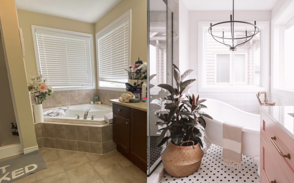
This entire project wouldn’t be without the vision and design of Delve Interiors. Which, I get that I get to fully use her services being local to her and perhaps – you are not. Rachael came up with a way to offer her services and ideas for a “Papaya inspired” bathroom of your own at a budget-friendly and location-friendly way.
Here’s a note from Rachael, Delve Interiors:
Are you interested in recreating this look in your bathroom OR something similar at a lower price point? Delve Interiors has been working hard behind the scenes to offer pre-curated design boards for purchase.
What’s a design board? They are your inspiration, your road map, and integral first steps in the design process. Our design boards will offer you multiple design concepts beautifully laid out, all pieces are hyperlinked for easy shopping, we offer colour schemes and designer tips and tricks to help execute the design seamlessly. No wait time, no stress, no time spent store hopping and internet surfing for the right pieces that ‘go’ together. The icing on the cake is that with any purchase of our design boards you also get 1 year access to our private facebook group ‘Delve In-Siders’. Here you will find tons of design content, tips, tricks,DIYs, how-to’s AND the opportunity to ‘ask the designer.’
Our ultimate goal at Delve Interiors is to offer accessible design because everyone deserves to love the home they’re in. I hope these design boards are a stress-free start to creating your ‘perfect’ space.
Click the link below to get the ‘papaya’ bathroom OR check out multiple other design boards we offered for all design styles and different rooms in your home.
https://www.delveinteriors.ca/shop/papaya
Hi, me, Sarah again.
This feels so big. So adulty. I honestly feel like I step into the Narnia of our home now when I enter this bathroom. It’s been such a JOY to do this renovation and to flip my internal narrative that said it was all going to be just an expensive disaster. It’s been an investment in our home, our happiness and creating a space for us and all who enjoy it with us.
I am beyond honoured to have had the opportunity to take my first dive into renovations with the best of the best in my area, with these incredible businesses who just KNOW what they’re doing when I do not. Really, truly, was a collective effort – and the outcome speaks for itself.
Until the next reno…
Which, by the way, if you as Shane, is his loft 😉
Disclosure: While this bathroom was not gifted to us, there were many upgrades that the individual businesses gave us throughout the process so that the items featured showcased their best in show items!

